Working with percolation clusters in Python
We’re working on a new project in FYS4460 about percolation. In the introduction of this project, we are given a few commands to help us demonstrate a few properties of percolation clusters using MATLAB.
As the Python-fan I am, I of course had to see if I could find equivalent commands in Python, and thankfully that was quite easy. Below I will summarize the commands that will generate a random matrix of filled and unfilled areas, label each cluster in this matrix and calculate the area of each such cluster. Finally, we’ll draw a bounding box around the largest cluster.
First of all, we need to include the pylab package together with the scipy.ndimage.measurements package:
from pylab import *
from scipy.ndimage import measurements
Now, let’s create a random matrix of filled and unfilled regions and visualize it:
L = 100
r = rand(L,L)
p = 0.4
z = r < p

imshow(z, origin='lower', interpolation='nearest')
colorbar()
title("Matrix")
show()
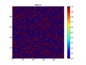
This creates a matrix of random numbers r before creating a map z of this matrix where each element is set to True if r < p and False if r > p:
Furthermore we want to label each cluster. This is performed by the scipy.ndimage.measurements.label function:
lw, num = measurements.label(z)
imshow(lw, origin='lower', interpolation='nearest')
colorbar()
title("Labeled clusters")
show()
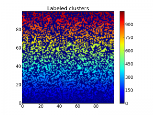
This labels each cluster with a number which may be visualized using the imshow function as above:
 Matrix with labeled clusters, so it is a bit hard to distinguish each
cluster.
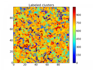
Beacause the label starts from the bottom up, the cluster colors are a bit too ordered, making it hard to distinguish two clusters close to each other. To fix this, we may shuffle the labeling with the following code:
b = arange(lw.max() + 1)
shuffle(b)
shuffledLw = b[lw]
imshow(shuffledLw, origin='lower', interpolation='nearest')
colorbar()
title("Labeled clusters")
show()
Now it is way easier to see the different clusters:
 The same matrix with all clusters labeled with a number.
After this we may want to extract some properties of the clusters, such as the area. This is possible using the scipy.ndimage.measurements.sum function:
area = measurements.sum(z, lw, index=arange(lw.max() + 1))
areaImg = area[lw]
im3 = imshow(areaImg, origin='lower', interpolation='nearest')
colorbar()
title("Clusters by area")
show()
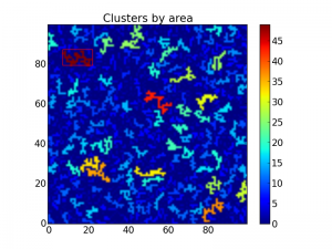
The above code now plots the same matrix as above, but this time with all clusters colored by area:
 Matrix with the clusters colored by area.
Finally, we may want to find the bounding box of the largest cluster, so we again may see if there is a path from one side to the other. This is possible by using the function scipy.ndimage.measurements.find_objects. Note however that this is a bit risky. If there are two clusters that are largest with the same area, find_objects will find the bounding box of both clusters. I’ll leave it up to you to figure out a method to avoid this if necessary. (Pro tip: Make a mapping of the cluster labels to the areas.)
With the find_objects function, we are able to plot a rectangle around the largest cluster:
sliced = measurements.find_objects(areaImg == areaImg.max())
if(len(sliced) > 0):
    sliceX = sliced[0][1]
    sliceY = sliced[0][0]
    plotxlim=im3.axes.get_xlim()
    plotylim=im3.axes.get_ylim()
    plot([sliceX.start, sliceX.start, sliceX.stop, sliceX.stop, sliceX.start],
                     [sliceY.start, sliceY.stop, sliceY.stop, sliceY.start, sliceY.start],
                     color="red")
    xlim(plotxlim)
    ylim(plotylim)

show()
This shows up like this:
 A bounding box on top of the largest cluster. The rest are colored by
area.
The whole program then becomes as follows:
from pylab import *
from scipy.ndimage import measurements

L = 100
r = rand(L,L)
p = 0.4
z = r<p

figure(figsize=(16,5))
subplot(1,3,1)
imshow(z, origin='lower', interpolation='nearest')
colorbar()
title("Matrix")

# Show image of labeled clusters (shuffled)
lw, num = measurements.label(z)
subplot(1,3,2)
b = arange(lw.max() + 1) # create an array of values from 0 to lw.max() + 1
shuffle(b) # shuffle this array
shuffledLw = b[lw] # replace all values with values from b
imshow(shuffledLw, origin='lower', interpolation='nearest') # show image clusters as labeled by a shuffled lw
colorbar()
title("Labeled clusters")

# Calculate areas
subplot(1,3,3)
area = measurements.sum(z, lw, index=arange(lw.max() + 1))
areaImg = area[lw]
im3 = imshow(areaImg, origin='lower', interpolation='nearest')
colorbar()
title("Clusters by area")

# Bounding box
sliced = measurements.find_objects(areaImg == areaImg.max())
if(len(sliced) > 0):
    sliceX = sliced[0][1]
    sliceY = sliced[0][0]
    plotxlim=im3.axes.get_xlim()
    plotylim=im3.axes.get_ylim()
    plot([sliceX.start, sliceX.start, sliceX.stop, sliceX.stop, sliceX.start],
                     [sliceY.start, sliceY.stop, sliceY.stop, sliceY.start, sliceY.start],
                     color="red")
    xlim(plotxlim)
    ylim(plotylim)

show()
